
ShopClass is My Happy Place

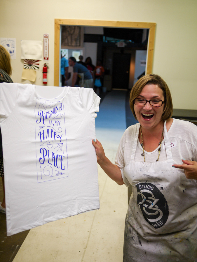
Wednesday night was the night I got to reveal a project I’d been working on behind the scenes—and I got to do so in front of an audience of about 40 people. (No pressure.) Along with Ashley Hawkins (a badass with a big heart) and her team of Studio Two Three talent, I helped guide a room full of willing participants on a screen-printing expedition. And it was awesome!
When Ms. Elleby Design originally tapped me to do ShopClass, I jumped at the opportunity. My role was simply to come up with a series of Richmond icons or graphics and Studio Two Three would help everyone screen print them on t-shirts. It sounded like a lot of fun, and more importantly, it was months away! Then, before I realized it, it was the end of July, and I needed to send in my designs.
Oh. Crap.
Ok, guys. Time for a free lesson! Let's call it the Carrie, Ink Design Method (CIDM®). It goes this:
Step 1: Wait until there is absolutely no more time to procrastinate
Step 2: Spend hours on Pinterest—half of that time thinking about a new hairstyle, the other half following links that ultimately lead to shopping
Step 3: Open a sketchbook and stare
Step4: Consider painting your nails
Step 5: Panic for a while; Get a snack
Step6: Think of ways to get out of the project
Step 7: Paint nails
Step 8: Make a list of other people who would have been better at the project in the first place
Step 9: iMessage with a friend about the project to tell them how screwed you are
There are more steps, but that’s when it happened! I was talking to my friend Debbie about one of the ideas I had that was just WAY too complicated for its own good. Somehow we got on the topic of the article that came out about Richmond being the happiest city in the country, and she said "Richmond is my happy place." Aha! The crazy thing is, I had had that thought early on, but since I was determined to do a series of different topics to appeal to a wider audience, and I couldn’t think of any other statements that matched, I tossed it. Hearing it come from someone else made me realize it could appeal to everyone if I designed it just right.
So working strictly with typography (my go-to tool of the trade) I designed five variations of this phrase with the goal that at least one design would appeal to everyone. By the feedback on Wednesday night—mission accomplished!
Here are the five designs:
I’m psyched by how well they turned out. It gave me the opportunity to try out a few new typefaces, use a few typefaces I normally dislike in a way that changed my opinion, and renewed my appreciation for those designers who can truly hand letter their work (because I tried, and… well, maybe next time).
The RIMHP message hits home with my newfound mission, so I hope that it helps remind others to focus on what matters as well: being happy.
Below are shots from the class. I am working on a few product ideas for these buggers and hope to have something new in the Blunt Objects store soon. When I do, I’ll be donating a portion of the proceeds back to Studio Two Three. It's a phenomenal project, and I wish I didn’t live 400 miles away. Otherwise, I’d be there all the time!
8.13.14 // Session 2 / SHOP CLASS: The RVA Graphic Project


Info on Studio Two Three

Be notified about RIMHP products
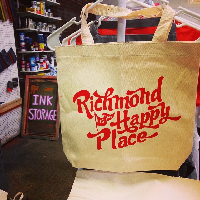
I'm working really hard on tote bags because everyone went crazy about this picture. Stay tuned.