Casper's General Store Brand Identity | Concept 2
Goals
In addition to launching your business, I designed these concepts with the following factors in mind.
- To create a thriving local business that acts as the center of town
- Enhance the appeal of Pillow, PA and drive out-of-town traffic
- Drive home a sense of community and build a loyal base of regular customers
- Offer real food and necessities at a convenience
Target Audience
- Natalie: A 41-year-old mother of 2 who works as an office manager in Harrisburg, she is busy but wants to make sure her family is taken care of first and foremost.
- Joe: A 68-year-old retired factory worker who wants a place to spend a part of his day to catch up (or gossip) with his fellow-retired friends and neighbors, to have a great cup of coffee or a baked treat while he reads or works on his puzzles, and just to feel like he is still a part of something
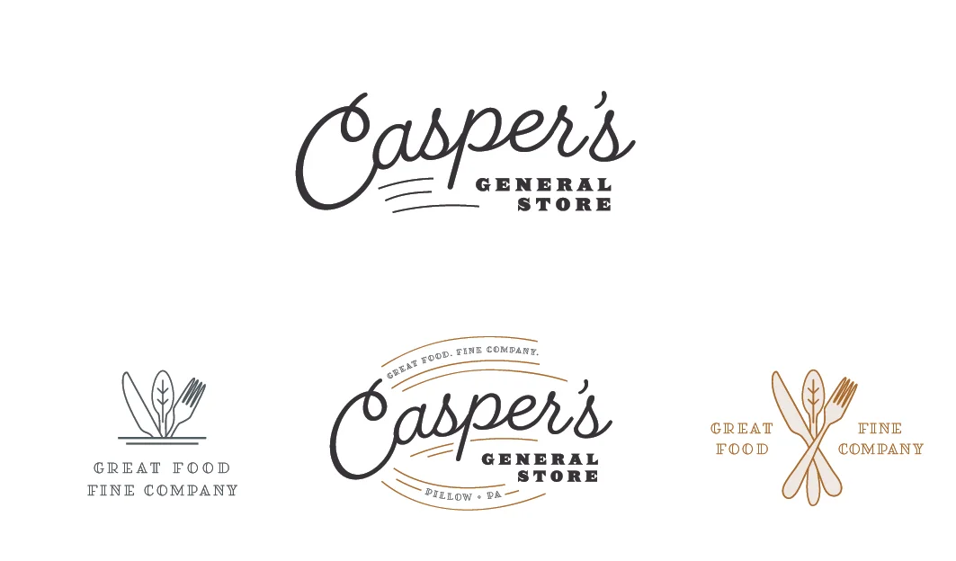
Primary & Secondary Logo
I directed this concept a little more towards Natalie than Joe, but it remains steeped in tradition so as to appeal to both of your ideal customer bases. The treatment of "Casper's" appears handwritten, bringing a friendliness and relaxed introduction to the brand. "General Store" is strong and rugged, a nice contrast to the handwriting and unconventional hierarchy of the store name.
Icon
I developed an icon to enhance the sense of hospitality and community. The utensils join giving off a relaxed and casual vibe. The center of the spoon has a small little detail that ties it in with nature and can represent other qualities like growth, stability, family, etc. Separately each of these elements might seem too generic (or perhaps predictable), but together they create a unique twist and tone for CGS.
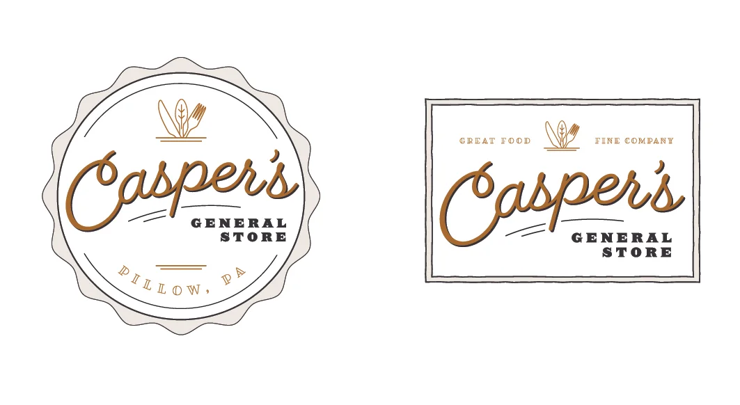
Badges and Lockups
Much like the first concept the creation of badges evokes a familiarity and degree of trust. Inspired by bottle caps and old food labels, these lockups add range to the branding and open you up to possibilities for packaging.
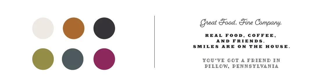
Color Palette
Once again, this color palette is inspired by the fall season. I've kept the overall tone of this option lighter and fresher to appeal to your female audience.
Typography
This assortment of typefaces pulls from a wide range of styles. The combination will allow you to change tone dependant upon messaging and will create a unified but playful brand system.
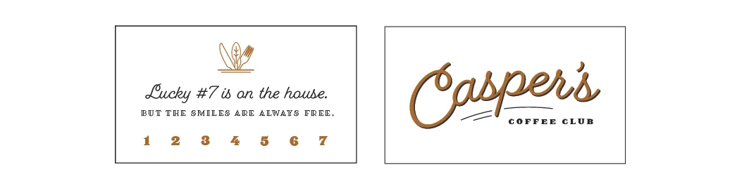
Application
I've demonstrated how these elements can be used with a small sampling of collateral pieces to provide more context and to illustrate the flexibility of this system.